A lightweight, accessible, TypeScript-ready React component for pie and donut SVG charts.
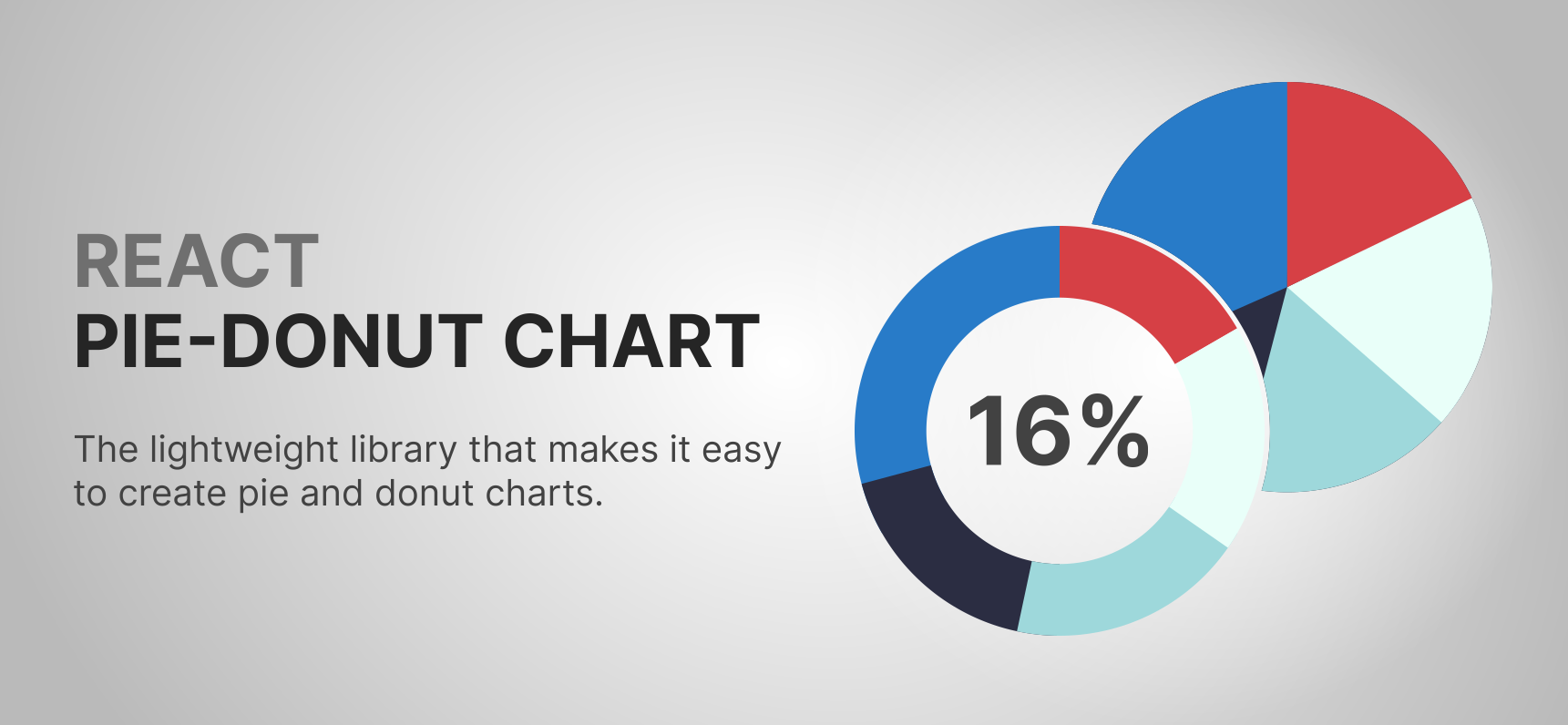
This package is in active maintenance. The recent maintenance pass modernized the local toolchain, restored tests on current Node versions, added package smoke tests, fixed SSR and resize-cleanup issues, improved edge-case geometry handling, added an O(n) performance refactor, and added ARIA roles and keyboard accessibility semantics.
The public API is intentionally kept backward-compatible. New functionality is added through optional props only.
CI runs on every PR and push to
main. Release automation starts from a manual GitHub Actions dispatch and then handles the release PR, tag, npm publish, GitHub Release, and demo-site sync automatically.
mainis branch-protected: direct pushes/merges are blocked. Changes must go through a pull request with the required checks green.
npm install @garvae/react-pie-donut-chartpnpm add @garvae/react-pie-donut-chartyarn add @garvae/react-pie-donut-chartimport PieDonutChart, { DataItem } from '@garvae/react-pie-donut-chart';
const data: DataItem[] = [
{ id: 'react', value: 40, color: '#61dafb' },
{ id: 'typescript', value: 35, color: '#3178c6' },
{ id: 'other', value: 25, color: '#7c3aed' },
];
export function MyChart() {
return <PieDonutChart data={data} size={240} />;
}Use donutThickness to create a donut ring:
<PieDonutChart data={data} size={240} donutThickness={40} /><PieDonutChart data={data} size={240} gap={5} /><PieDonutChart data={data} size={240} donutThickness={40}>
<span style={{ fontSize: 20, fontWeight: 'bold' }}>42%</span>
</PieDonutChart>Or use the built-in text prop:
<PieDonutChart data={data} size={240} text="Total: 100" />import { useRef } from 'react';
import PieDonutChart, { DataItem } from '@garvae/react-pie-donut-chart';
export function ResponsiveChart() {
const ref = useRef<HTMLDivElement>(null);
return (
<div ref={ref} style={{ width: '100%', height: 300 }}>
<PieDonutChart data={data} parentRef={ref} />
</div>
);
}import { useState } from 'react';
import PieDonutChart, { DataItem } from '@garvae/react-pie-donut-chart';
export function ControlledChart() {
const [selected, setSelected] = useState<string | undefined>(undefined);
return (
<PieDonutChart
data={data}
size={240}
selected={selected}
onSegmentClick={(segmentId) => setSelected(prev => prev === segmentId ? undefined : segmentId)}
/>
);
}<PieDonutChart
data={data}
size={240}
ariaLabel="Technology usage chart"
getSegmentAriaLabel={(segment, index) =>
`${segment.id ?? `Segment ${index + 1}`}: ${segment.value}%`
}
/>PieDonutChart renders an accessible SVG chart out of the box:
- The root
<svg>hasrole="img"andaria-label(defaults to"Pie donut chart"). - Use
ariaLabelto give each chart on the page a distinct description. - Each interactive segment has
role="button"and anaria-label. - Use
getSegmentAriaLabelto return human-readable labels per segment. The factory receives the segment'sDataItemand its zero-based rendered index. - The selected state is exposed in each segment's accessible label.
- Keyboard navigation:
Tabmoves focus between segments;EnterorSpaceactivates the focused segment (callsonSegmentKeyEnterDownand toggles selection whenisSelectOnKeyEnterDownistrue).
<PieDonutChart
  data={data}
  size={300}
  ariaLabel="Quarterly results chart"
  getSegmentAriaLabel={(segment, index) =>
    `${segment.id ?? `Q${index + 1}`}: ${segment.value} units`
  }
  onSegmentKeyEnterDown={(segmentId) => console.log('activated:', segmentId)}
/>The package ships its own type declarations. No separate @types/* package is needed.
import PieDonutChart, {
  DataItem,
  PieDonutChartProps,
} from '@garvae/react-pie-donut-chart';

const data: DataItem[] = [
  { id: 'a', value: 60, color: '#287BC8' },
  { id: 'b', value: 40, color: '#D64045' },
];

// Use PieDonutChartProps when you need the full props type:
const chartProps: PieDonutChartProps = {
  data,
  size: 300,
  ariaLabel: 'My accessible chart',
};

export function TypedChart() {
  return <PieDonutChart {...chartProps} />;
}The component is SSR-safe. It does not access browser globals during server-side render.
useLayoutEffect calls are replaced with useIsomorphicLayoutEffect, which falls back
to useEffect on the server.
When rendered server-side, the chart produces a static <svg> with no computed size
until the client hydrates and initialises dimensions from the size prop or parentRef.
| Name | Type | Required | Default | Description |
|---|---|---|---|---|
value |
number |
✓ | — | Segment value. Must be a positive finite number. |
id |
string |
— | auto | Unique segment identifier. Used by selected, onSegmentClick, and onSegmentKeyEnterDown callbacks. |
color |
string |
— | auto | Segment color. HEX strings are recommended (#ffffff, #fff, ffffff, fff). |
order |
number |
— | auto | Display order. order: 0 is valid and treated as the first position. |
Either size or parentRef is required. They are mutually exclusive.
| Prop | Type | Default | Description |
|---|---|---|---|
data |
DataItem[] |
— | Required. Chart data array. |
size |
number |
— | Fixed chart size in pixels. Mutually exclusive with parentRef. |
parentRef |
RefObject<HTMLElement> |
— | Ref to a parent element; the chart auto-resizes to match its dimensions. Mutually exclusive with size. |
ariaLabel |
string |
"Pie donut chart" |
Accessible label for the root <svg>. Provide a unique value when multiple charts appear on the same page. |
getSegmentAriaLabel |
(segment: DataItem, index: number) => string |
auto | Factory that returns an accessible label for each interactive segment. |
animationSpeed |
number |
200 |
Segment animation duration in milliseconds. |
chartCenterSize |
number |
— | Diameter of the center circle element (text background). Use donutThickness for donut charts instead. |
children |
ReactNode | string | number |
— | Content rendered in the chart center via <foreignObject>. |
className |
string |
— | Class name applied to the root <svg>. |
classNames |
PieDonutChartPropsClassNames |
— | Class names for individual chart sub-elements. See below. |
colors |
PieDonutChartPropsColors |
— | Color overrides for individual chart sub-elements. See below. |
donutThickness |
number |
— | Creates a donut chart by setting the segment ring thickness in pixels. |
fontSize |
number |
— | Center text font size override. Auto-calculated from chart size by default. |
gap |
number |
— | Gap between segments in pixels. |
hoverScaleRatio |
number |
1.05 |
Scale factor when a segment is hovered, selected, or focused. |
isScaleOnHover |
boolean |
true |
Enable or disable segment scale on hover, select, or focus. |
isSelectOnClick |
boolean |
true |
Enable or disable segment selection on click. |
isSelectOnKeyEnterDown |
boolean |
true |
Enable or disable segment selection on keyboard activation (Enter or Space). |
isSelectedValueShownInCenter |
boolean |
true |
Show the selected segment's value in the chart center. |
maxSize |
number |
— | Maximum chart size when using parentRef. |
minSize |
number |
— | Minimum chart size when using parentRef. |
onSegmentClick |
(segmentId: string) => void |
— | Callback fired on segment click. Receives the segment's id. |
onSegmentKeyEnterDown |
(segmentId: string) => void |
— | Callback fired when a segment is activated via keyboard (Enter or Space). Receives the segment's id. |
resizeReRenderDebounceTime |
number |
50 |
Debounce time (ms) for resize-triggered re-renders. Set to 0 to disable. No effect when size is provided. |
selected |
string |
— | Externally controlled selected segment ID (matches DataItem.id). |
stylesHoveredSegment |
CSSProperties |
— | Custom inline styles applied to hovered, selected, or focused segments. |
tabIndex |
number |
0 |
Tab index for keyboard navigation. Set to -1 to exclude the chart from tab order. |
text |
string |
— | Custom text shown in the chart center. When absent, the total or selected segment value is displayed. |
widthSegmentFocusedOutline |
number |
auto | Width of the focus outline (stroke) on focused segments. Defaults to chartSize × 0.0066. |
| Name | Type | Description |
|---|---|---|
chartBackground |
string |
Root SVG background element |
chartCenter |
string |
Center circle (donut hole) |
chartSegment |
string |
Individual segment paths |
chartSegmentsBackground |
string |
Background element rendered behind all segments |
children |
string |
Children <foreignObject> wrapper |
svgGroupSegments |
string |
Segments <g> group |
svgGroupSegmentsBackground |
string |
Segments background <g> group |
svgGroupText |
string |
Text <g> group |
svgObjectText |
string |
Text <foreignObject> element |
text |
string |
Center text <div> container |
| Name | Type | Default | Description |
|---|---|---|---|
chartBackground |
string |
— | Full-chart background color |
chartCenter |
string |
#ffffff |
Center circle (donut hole) color |
segmentFocusedOutline |
string |
#287bc8 |
Focus outline (stroke) color |
segmentsBackground |
string |
— | Background color behind all segments. Useful for coloring the gap space in donut charts. |
text |
string |
— | Center text color. Defaults to the color of the selected or largest-value segment. |
Color format: HEX strings are recommended for all color props. Supported formats:
#ffffff,ffffff,#fff,fff.
pnpm install           # install dependencies
pnpm run check         # run formatter + linter
pnpm run lint          # lint only
pnpm run format:check  # check formatting without writing
pnpm run type-check    # TypeScript check (src)
pnpm run type-check:test  # TypeScript check (test files)
pnpm run build         # build dist/
pnpm run test          # run Jest test suite
pnpm run test:cover    # run tests with coverage report
pnpm run pack:smoke    # pack tarball and verify contents
pnpm run size          # check bundle size
pnpm run check:all # run all checks in sequencepnpm run demo:install # build the library and install demo dependencies
pnpm run demo:dev # serve the demo app against the local dist package
pnpm run build:watch # optional: rebuild dist/ on library changes
pnpm run demo:build # build the demo for production / Pages
pnpm run demo:preview # preview the built demo locallyThe demo app lives in demo/ and consumes the local package from dist/.
This is the fastest way to validate real-world usage before publishing.
The local quality gate (pnpm run check:all) covers:
- Biome formatting and lint checks
- TypeScript type checks for source and test files
- Build verification via tsup
- Jest test suite (~60 suites, ~197 tests)
- Coverage reporting (near-100% statement coverage for the maintained behavior)
- Package smoke tests — verifies tarball contents and entry-point imports
- Bundle size check
- Dependency audit
Releases start from the manual GitHub Actions Release workflow. The workflow:
- calculates the next version from the dispatch inputs
- runs the full quality gate and a public-registry version preflight
- creates and uploads the exact npm tarball artifact
- on
dry_run=false: opens and merges the release PR, creates the git tag, publishes to npm through Trusted Publishing, creates the GitHub Release, and lets the demo site update frommain
Dry-run remains the default, so nothing is published until you explicitly opt in.
See docs/release-checklist.md for the operator guide.
Give a ⭐ if this project helped you!
Contributions, issues, and feature requests are welcome! Feel free to check the issues page. You can also open an issue if you want to discuss a contribution before sending a PR.